OUR CHALLENGE
We need a place to store additional information that may be important for specific documents.
While re-evaluating our onboarding flows, we realized that specific pieces of information may not be as readily available from users and case workers.
This would prevent case workers and users from moving through the onboarding flow, wasting their time and resources.
The problem flow that users and case workers come across with the onboarding flow.
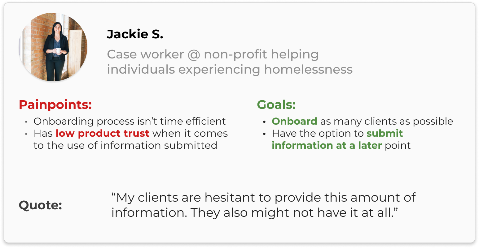
User Persona
I had used previous research insights and user interview transcripts that the Product Manager had conducted to understand pain points.
I then created a persona to summarize my findings from the insights and transcripts, highlighting key pain points and needs of a user.
FEATURE BREAKDOWN
How did we structure this feature?
We worked with our Product Manager to align on the features needed for this project. The larger team had outlined four main parts of the onboarding flow that could be moved to ‘My Information’.
Onboarding re-evaluation identified that these four sections would be moved to the 'My Information' feature.
User Flows
The design team then crafted brief user flows that outlined the main experience along with edge cases that we kept in mind when designing.
The primary actions users will go through in 'My Information'.
The primary edge cases that users can come across. These cases are pretty standard for input fields, but a visualization helped us clearly understand how we can design for these situations.
Sketches
We then created quick sketches of how we envisioned the feature and then aligned on a couple sketches to move forward.
Lofi Wireframes
We then created quick wireframes to visualize the feature and understand how the content would place against the entire screen.

With certain sketches, we mocked them in low-fidelity to get a better understanding of the visual spacing between elements. We narrowed in on the bottom right design because of its simplicity and clear visual elements.
DESIGN ITERATIONS
Learning to juggle technical constraints.
Our first design relied on modals where users would submit information.
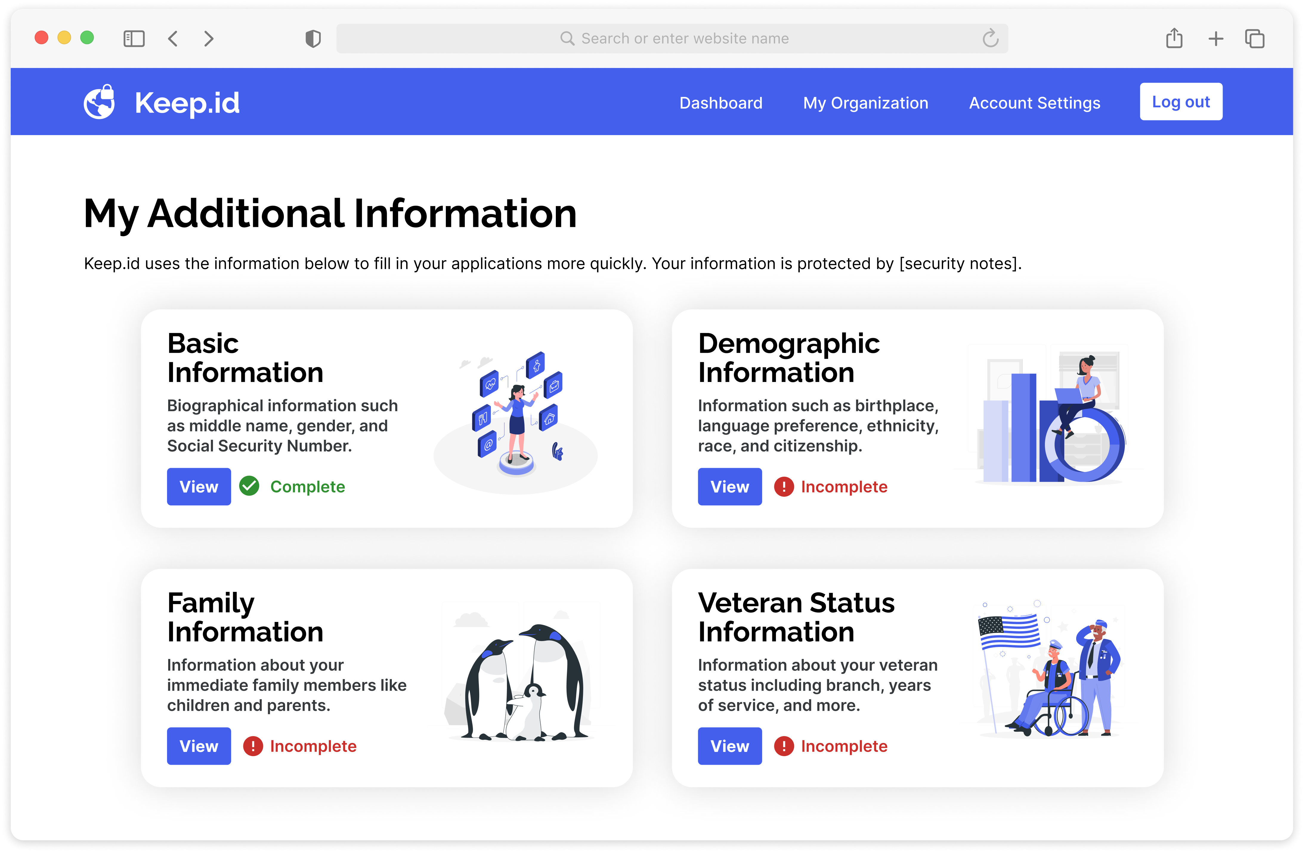
The main page for 'My Information'. It was previously called 'My Additional Information' but later shortened.
Visual signifiers show incomplete fields. Additionally, the finish button is disabled until the field is complete.
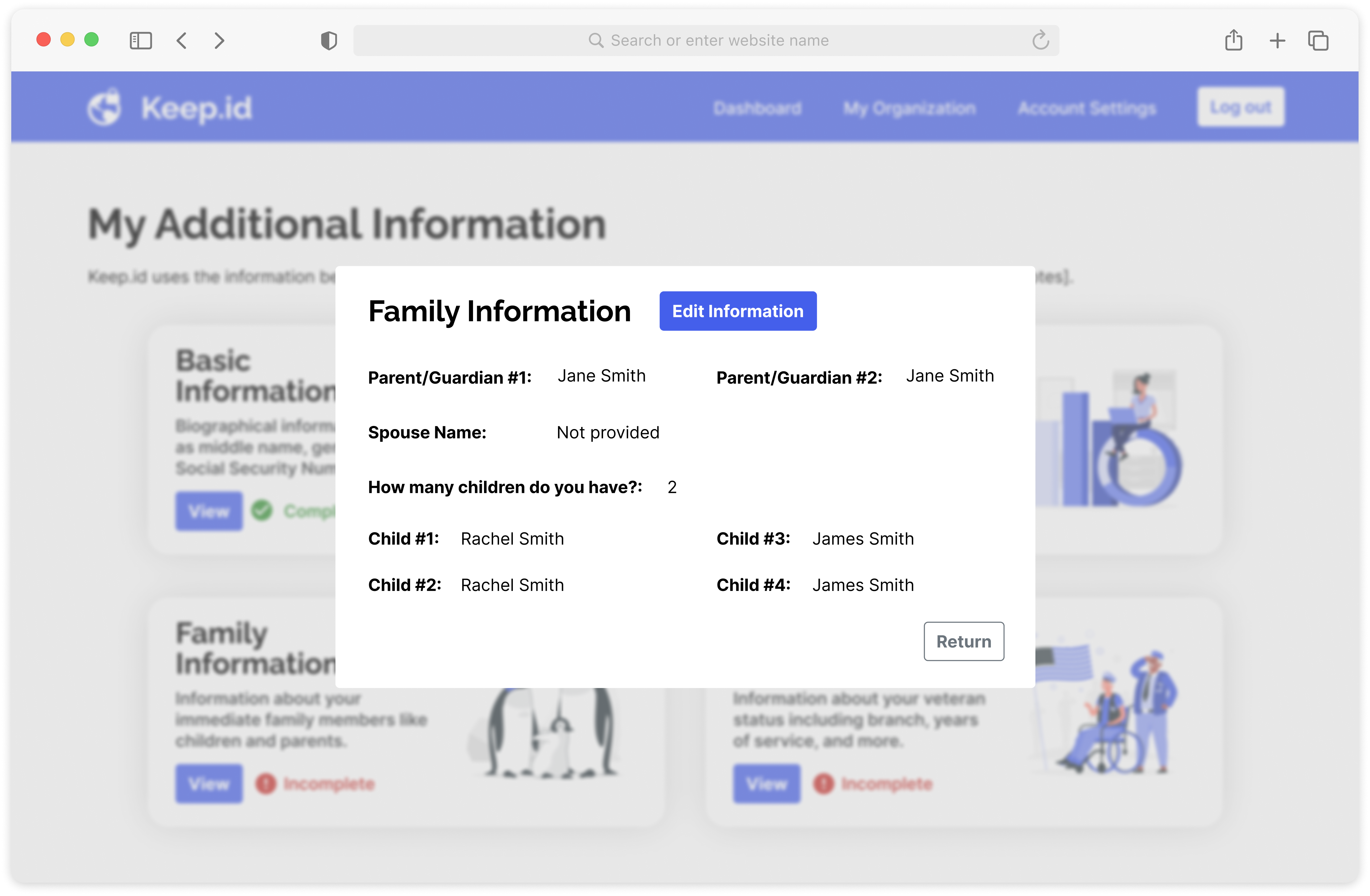
Clicking into each section, users get a quick view of the information they may have previously saved.
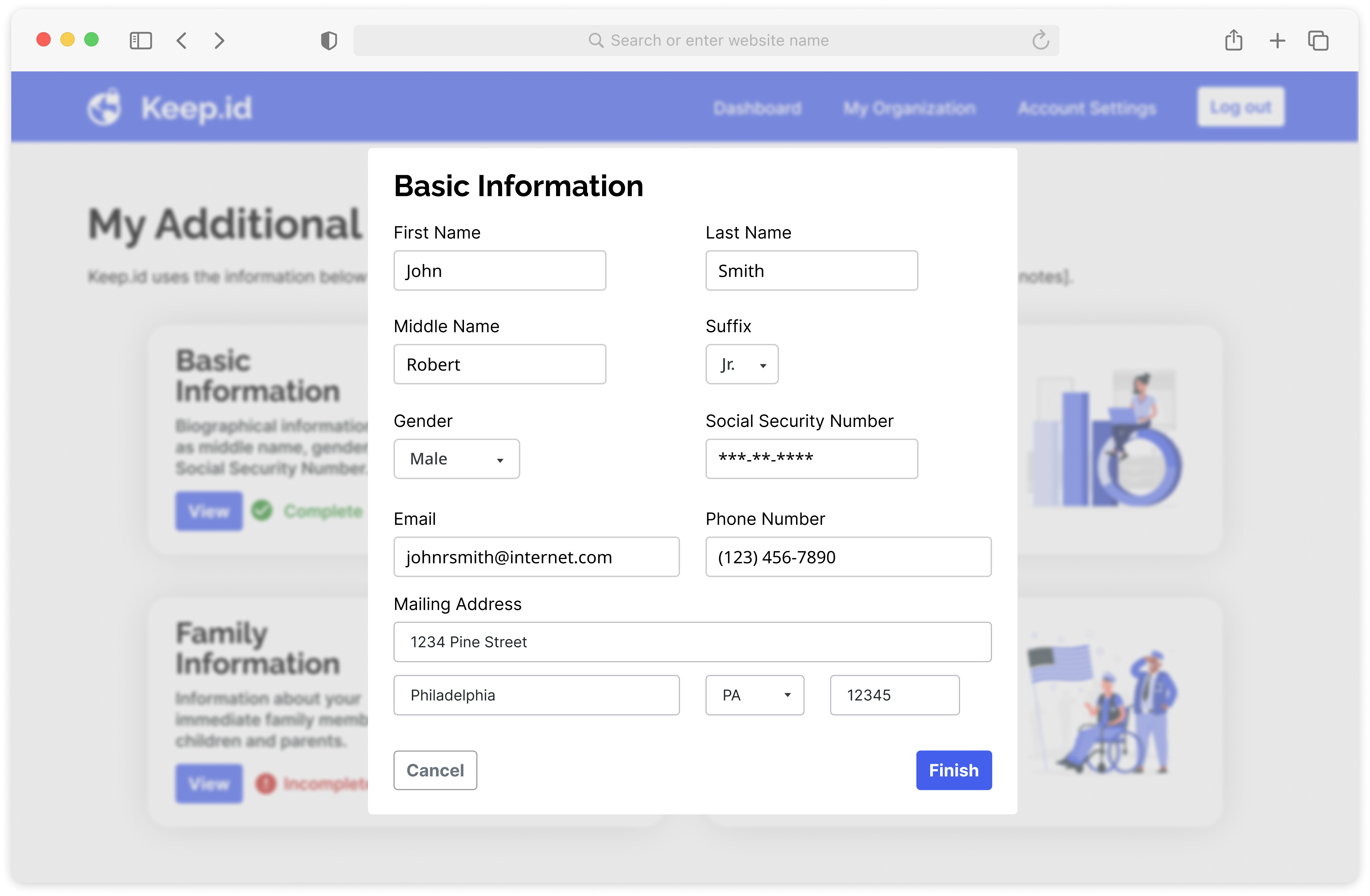
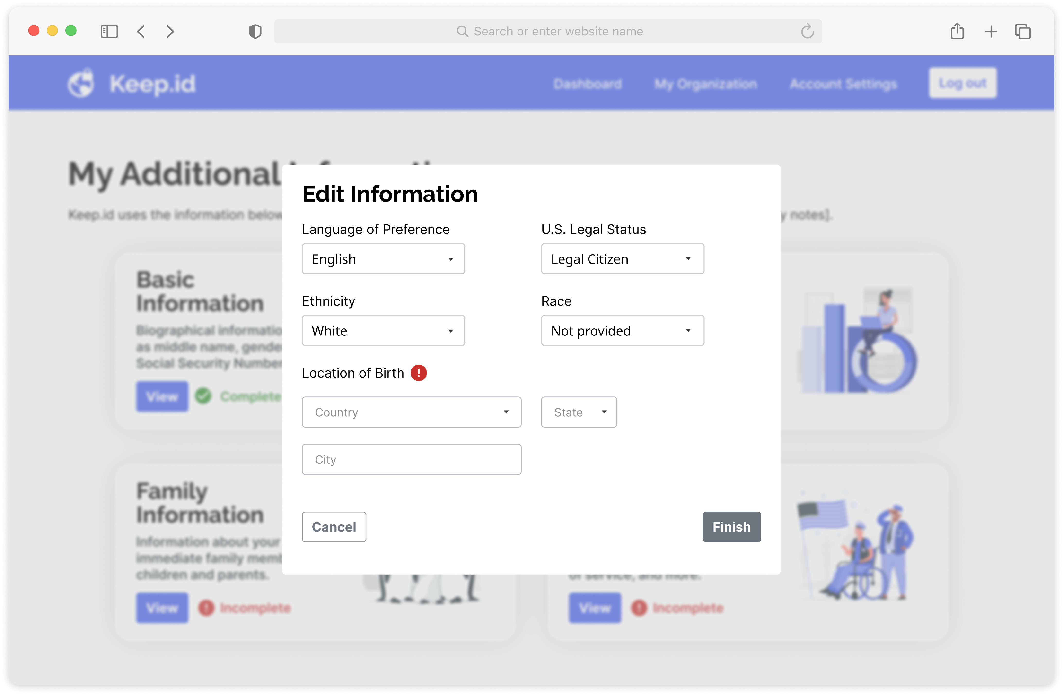
Input fields are presented when a user intends to edit the information for a specific section.
Aligning with developers...
... we discovered that a large use of modals was
not technically feasible.
Additionally, we also learned that this wasn’t the best idea given that pop-ups are generally used for quick pieces of information.
Critiquing our designs overall
While we went back to the drawing board, we also did an overarching critique of the designs which showed visual and interaction inconsistencies.
Our internal critique challenged our visual and interaction design skills; keeping them at the forefront when designing the next iterations.
The dashboard also received a redesign to fit with current design components and design standards.
Final Designs
Our final designs highlight changes to improve the visual and interaction design of the product.


